TripIt / Concur2012 – 2015
Turning a failed launch into a design practice
I shipped the ExpenseIt v1 wireframes in under a week, against a stakeholder direction that traded on magic, with no research program behind me and without being told the engineering team had already solved the hard part. The product underperformed — and that failure became the argument that gave TripIt contextual inquiry, its first generative user researcher, and a design process that outlasted the product itself.
Role
Senior UX Manager / Lead UX Designer
Timeline
v1 wireframes in under one week; practice change over the following two years
Scope
Native iOS receipt capture and expense reporting for TripIt and Concur
Target
Replace a prescribed direction with evidence about how business travelers actually file expenses
The Challenge
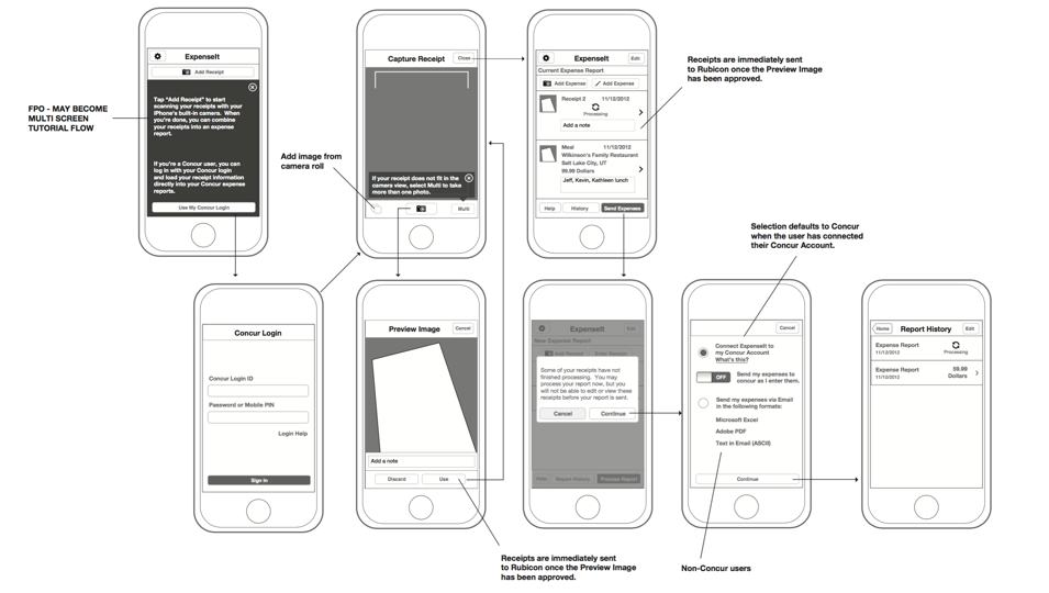
Under pressure, I created the v1 wireframes of the ExpenseIt app in record time — under a week from launch to delivery to Product Development. That included doing what I could to understand the problem space, running a rudimentary competitive analysis, and producing the wireframe document.
TripIt did not yet have a user research program, let alone a user researcher. I scoped to a Minimum Marketable Product: the smallest feature set that could compete with what was already in the space. Add expenses by photo or by hand, and export a report to PDF, Excel, or another expense system.
The Research Nobody Mentioned
Reading documents and converting them into structured data was TripIt’s bread and butter. Engineering had already been researching in-app OCR, and had a process they called triple tap: the user selects the data to be read, the app returns the parse, the user verifies it and assigns it to a field.
Certify, a direct competitor, was already shipping in-app OCR using a method practically identical to it.
I was brought on with little to no direction and nobody mentioned any of it. I learned about triple tap later, at which point it became a priority for inclusion — for the project team, anyway.
“Make It Magical”
The product direction from the stakeholder was that the app should be magical: the customer takes a photo of a receipt and everything else happens by itself, trading on the TripIt brand of automagical data analysis.
I liked the Google-like simplicity of the idea. I also immediately saw about a bazillion holes in it. To be magical, an app has to be both fast and accurate. Who cares how fast it is if it is wrong? Who cares how accurate it is if it takes forever to come back?
The build at that point took an average of fifteen minutes to return data — usually much longer — and was about eighty percent accurate. And it was not OCR doing the reading. It was a physical workbench of people in Manila.
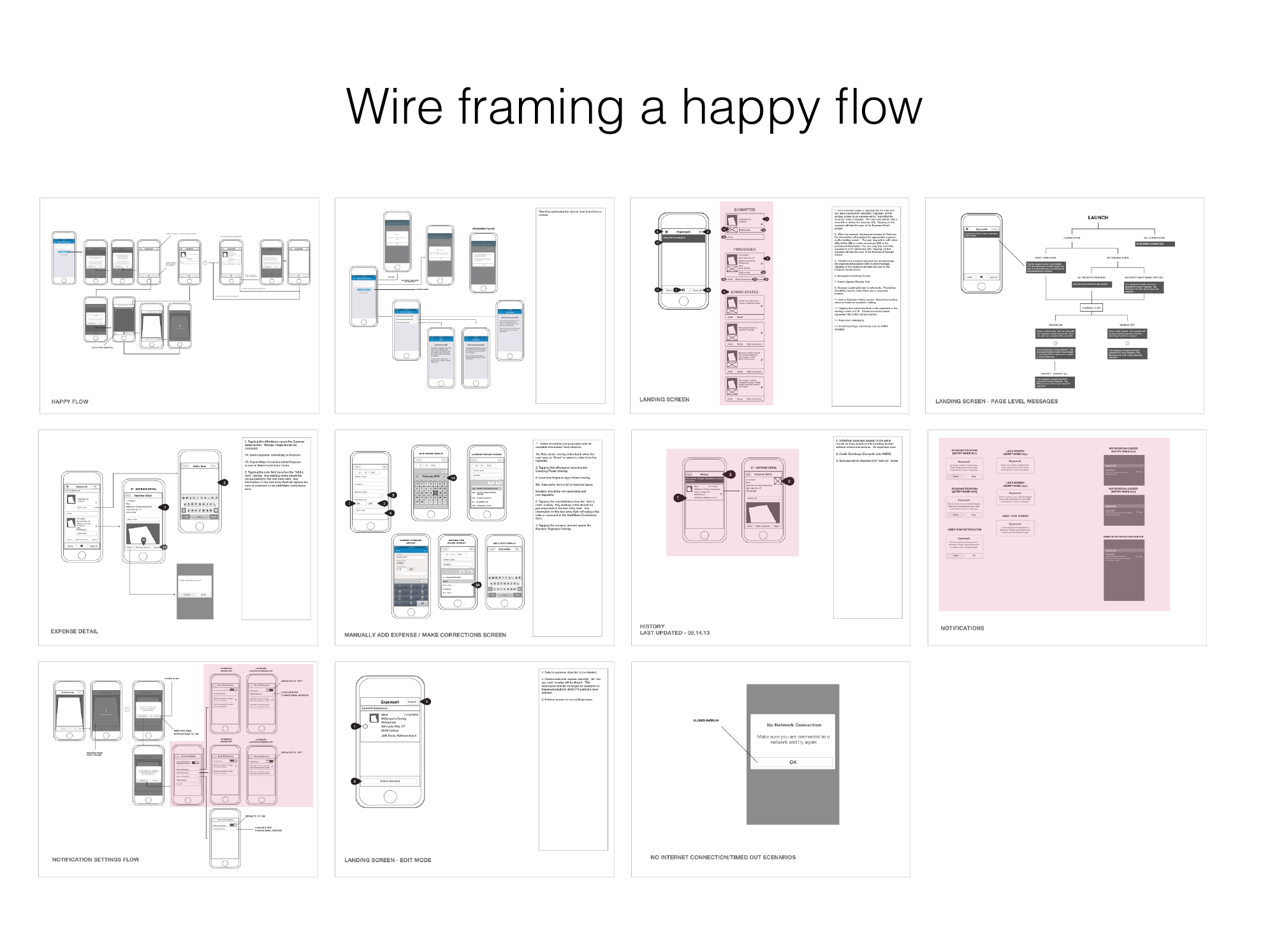
The fatal flaw in ExpenseIt v1 was that the prescribed direction sought to change the user’s behavior rather than augmenting their current behavior or providing compelling alternatives.
Recovering From “Magic”
It took a long time to get the stakeholder in a room face to face. He did not understand why we could not achieve the magic he was going for. So I walked him through the actual flow in the app, using real data from real submitted receipts, until the processed data came back wrong.
Stakeholder“It’s wrong! What do I do now?”
Me“Exactly.”
One flaw I had anticipated was that the app had no recovery path – what would the customer do if what was returned from the workbench was inaccurate or incorrect?
A correction workflow went into the app. I assumed converting that into manual entry would be a snap. No such luck — but the principle held: prototype with real data, and partner with analytics and engineering so you know what is actually happening under the hood of your own product.
Outcome
A user-centered practice, and a researcher to run it
v1 was only a moderate financial success, carried by existing sales to Concur customers, and the PM, UX, and engineering teams were all fairly demoralized by it. That failure bought what the roadmap never would have: a commitment to generative research and contextual inquiry; ideation based on user needs and competitive analysis rather than a use case of one; RITE testing to hone features and flows; and a design that works with users’ habits and workflows rather than attempting to redefine them. The process outlived the product and carried into TripIt’s parent company, Concur.

The Customers Named the Problem First
App Store reviews reinforced the concern before any research did. One reviewer described uploading “a week’s worth in one shot” and wondering whether the app would work better if they captured receipts as they went. Another described correction work that could not be undone once an expense reached Concur.
Some of the damage was positioning rather than design. The app only worked with Concur Expense, and we pushed to name it ExpenseIt PRO, or Concur-ExpenseIt, or anything that set that expectation before download. Low NPS and poor ratings became the catalyst for what we called ExpenseIt4Everyone.
Going to Where the Receipts Actually Were
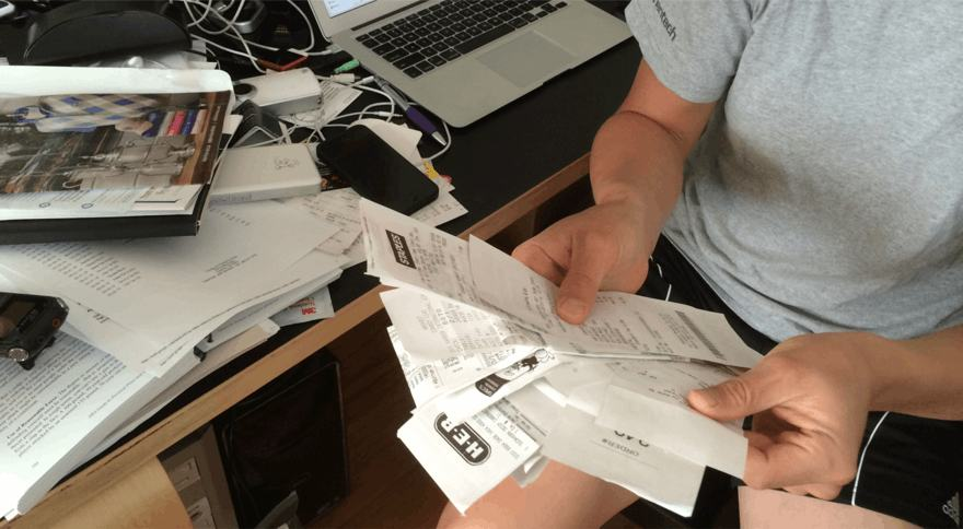
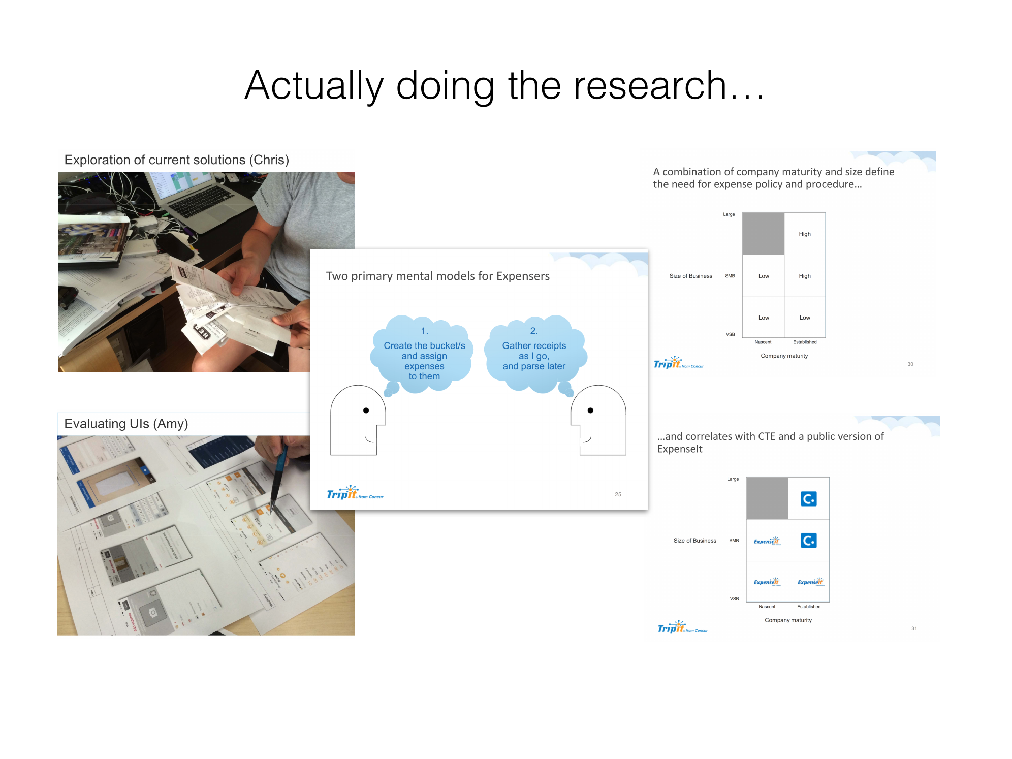
The failure of v1 generated interest in contextual inquiry as a way of both learning about our customers and getting smart about a business model that was not in TripIt’s wheelhouse. We watched people work: exploring their current solutions, then evaluating interfaces with them.
What came back was not one behavior but two mental models. Some people create the buckets first and assign expenses into them. Others gather receipts as they go and parse the whole pile later. v1 had been built for a third model that nobody used: capture and file each receipt in the moment.
It also reinforced my recommendation to add a generative user researcher to the team, to help develop and ratify product ideas before they entered the expensive product development pipeline.
Rebuilding the Process
Ideation moved to user needs and competitive analysis rather than a prescriptive direction from stakeholders, and we embraced RITE testing as a summative method. The competitive analysis of Abacus gave the team a shared, concrete picture of what an expense product could feel like.


Externalizing the Design Process
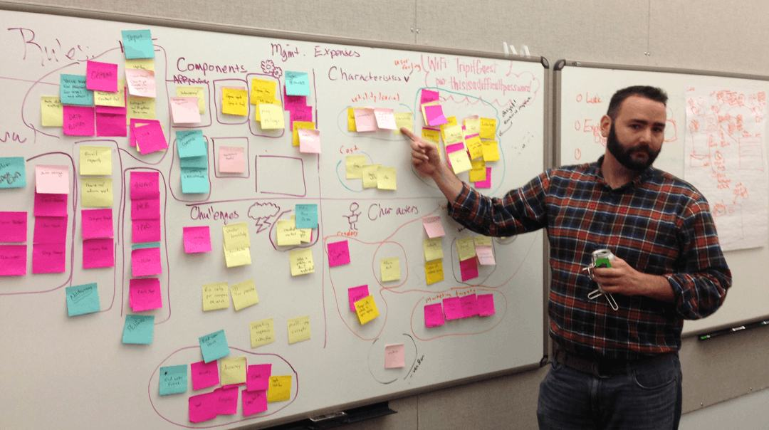
Given the previous fiascos, I wanted the UX team working as transparently as possible. I had been instrumental in designing the new office, and I negotiated for several whiteboard walls in it.
Then I pushed the team to use them. Sketching in the open invited PMs, developers, and stakeholders into the ideation rather than leaving it to design, and an entire wall became the working document the team collaborated on. I also draw really great dinosaurs.
Designing E4E for the Phone
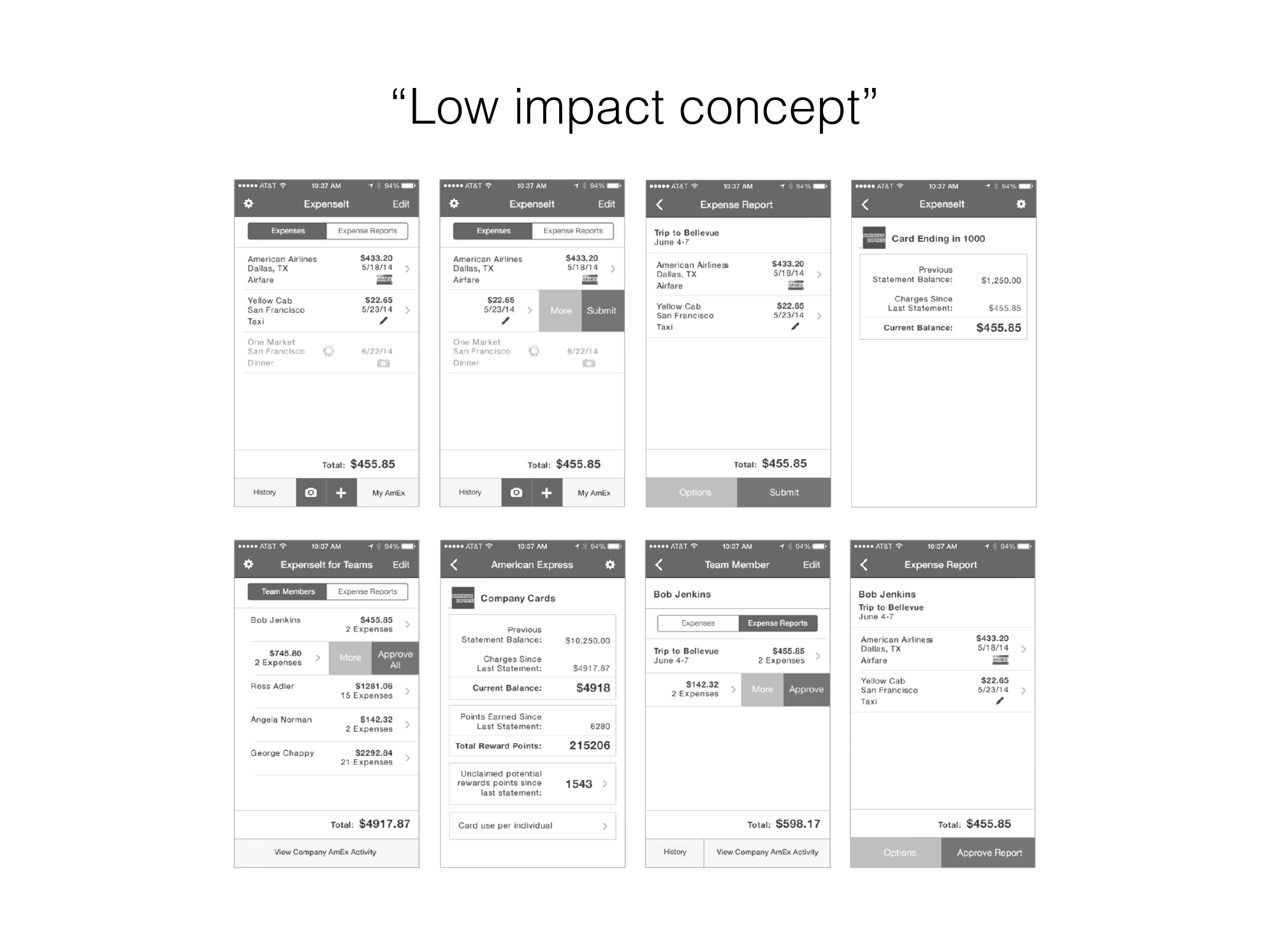
ExpenseIt4Everyone was a native iOS product, and the concepts were argued out on the phone rather than on a desktop canvas. Three directions ran in parallel: a low-impact version that stayed close to the shipped app, a set of mobile interaction patterns borrowed from consumer apps, and the one that won.

Work to Zero
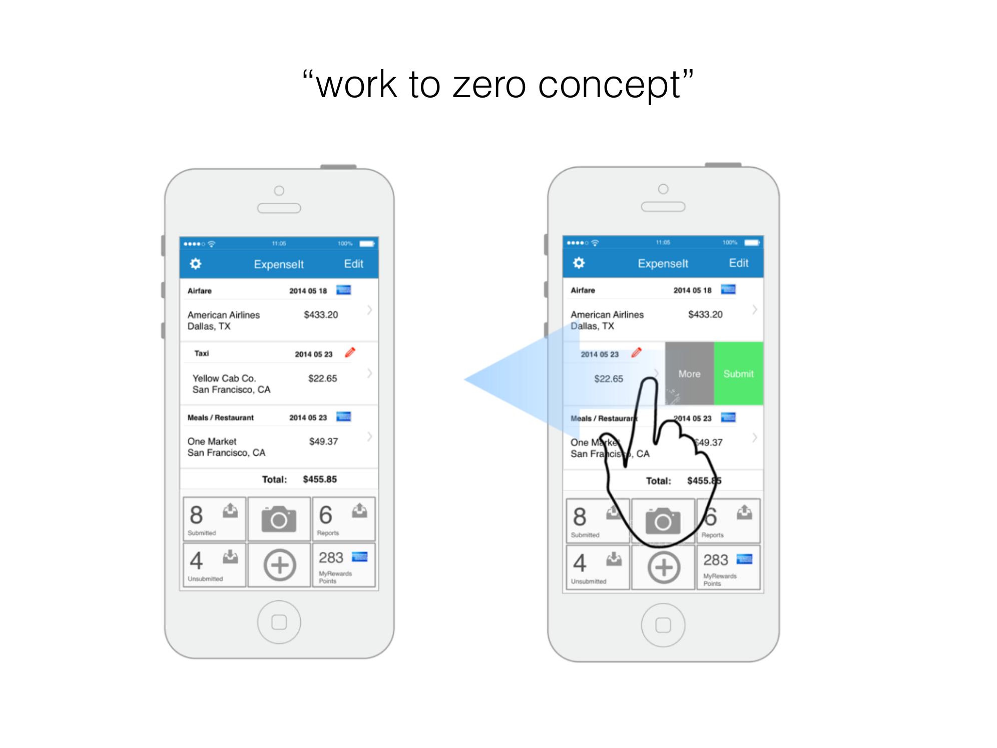
The organizing idea for E4E was Work to Zero: leverage the user’s natural desire for completion. Counters carry the state of the account — pending, reports, unsubmitted, rewards points — and the job of the interface is to help you drive the first number down.
That reframes the app around the batch behavior research had found instead of fighting it. A swipe on any row reveals the two actions that actually move an expense along, so clearing a trip’s worth of receipts is a rhythm rather than a form.

Paper First, Then Axure
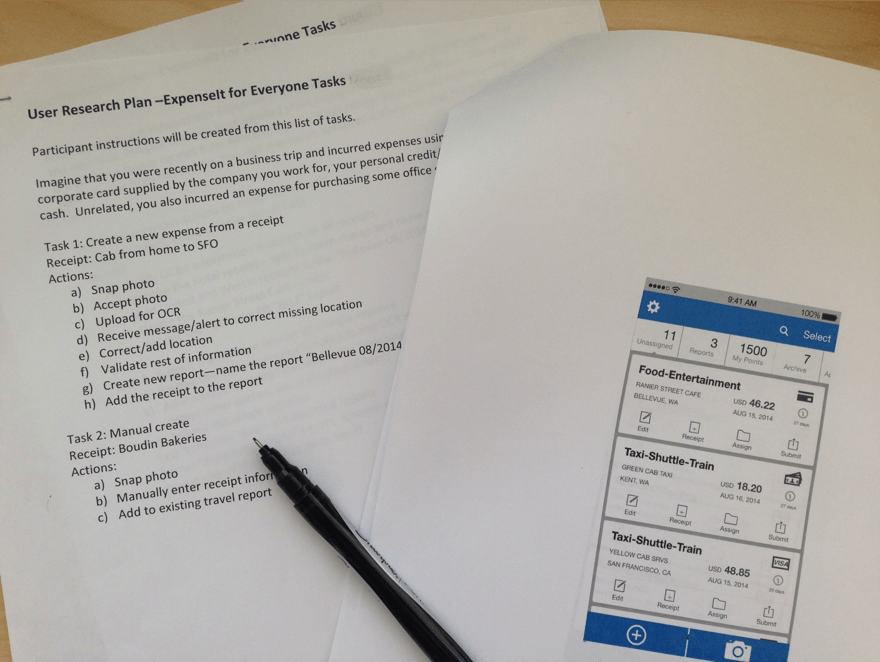
Concepts were tested on paper against a written research plan before anything was built, so we could learn from customers and refine features before investing in full design and development.
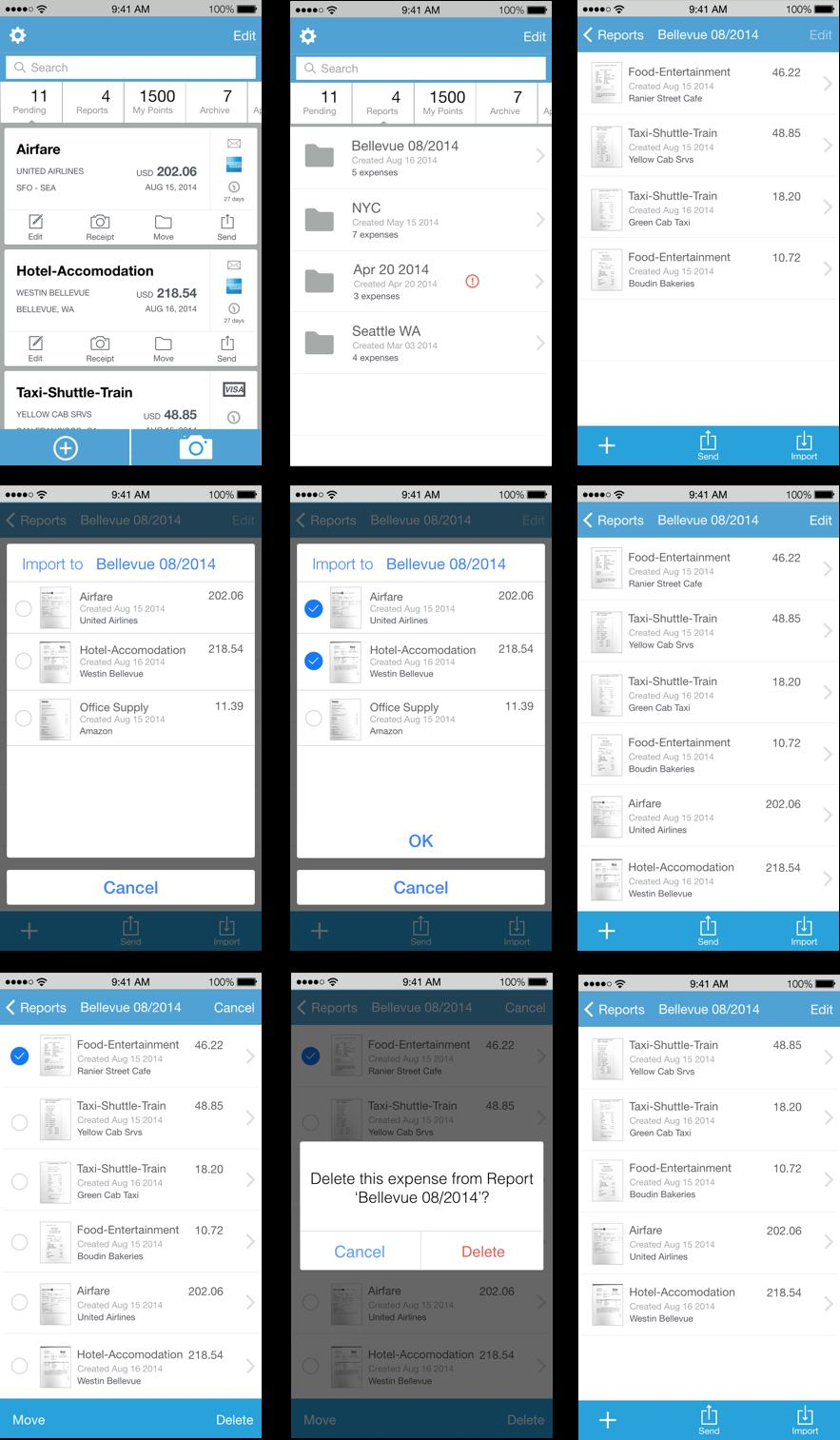
What survived that filter became an Axure prototype: report management, multi-select, import from a travel itinerary, and the destructive-action patterns that had caused so much correction pain in v1.
Reflection
I cannot say ExpenseIt4Everyone was a rousing success, or that it made it to market in this form. It did not. What it changed was how TripIt approached product design, rooted in user-centric methodologies — and that even rubbed off on TripIt’s parent company, Concur.
My pride in this project rests in illustrating the value of design to an organization that did not yet value design. The most useful thing a designer can produce is sometimes not the product. Sometimes it is the evidence that changes how the next twenty products get made.