Alaska Airlines2018 – 2020
Building Alaska Airlines’ cross-functional design system
I co-led the creation and adoption of Orion, a design system built jointly by designers and engineers at Alaska Airlines, establishing shared governance, accessible components, and a scalable operating model.
Role
Product Design Manager
Timeline
9 months
Scope
E-commerce design system
Target
Align design and development around a shared, accessible component system
The Challenge
Alaska relied on style guides maintained separately from production code. This created opportunities for design and implementation to drift apart. The team also lacked dedicated design-system designers and engineers. Any successful system would need to fit within existing product delivery while earning adoption from both disciplines.
Creating a Shared Operating Model
Dale Sande, a Design Technologist, and I co-led Orion with complementary areas of focus. Dale concentrated on coded, reusable components, while I focused on connecting design and development through shared guidance, resources, and governance. Because Orion had no dedicated team, we established an operating model in which product teams created components through active delivery work, supported by twice-weekly Orion Design Syncs.
OUTCOME
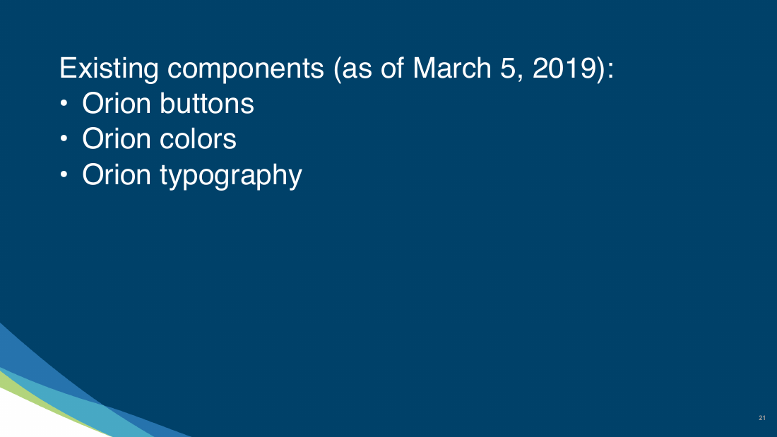
35 core components
Orion formed the foundation for what became the Auro design system. More importantly, it established a shared operating model through which Alaska’s designers and engineers could create, review, and implement accessible components together.
The first hurdle towards creating any design system is explaining the difference between a style guide and a design system. These are the definitions that we agreed upon at Alaska Airlines:
A style guide is built and maintained separately from the code— a recipe for error and inconsistency.
A design system provides structure, governance, and consistency around a design—a way to implement a consistent look, feel, and usage.
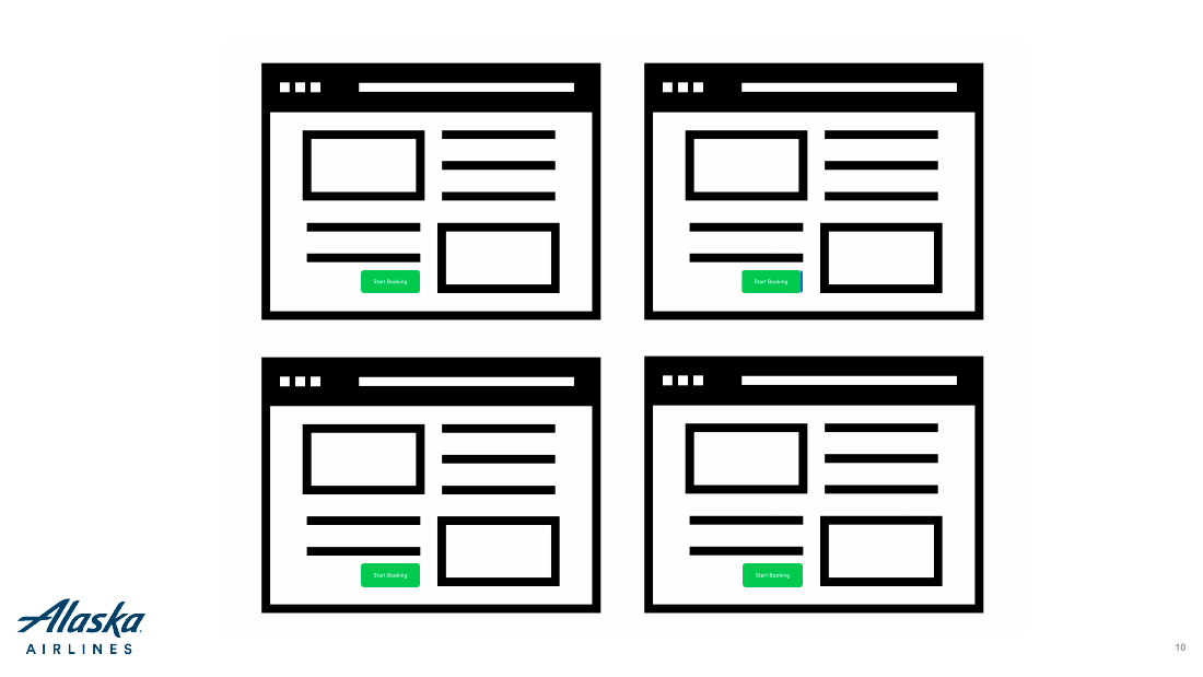
The second hurdle is socializing the idea of a design system because they are far more complex than a style guide. A design system includes efforts from both dev and design, developing fully realized components adds development time when a product team produces them, and a dedicated team of PMs, designers, and devs that can often be designing components in a vacuum.
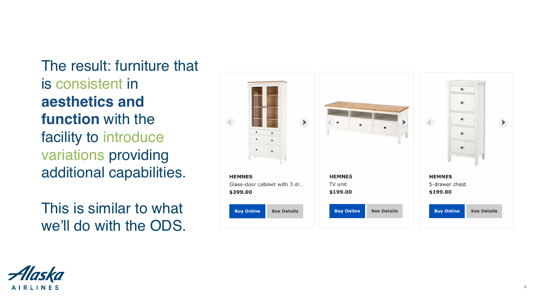
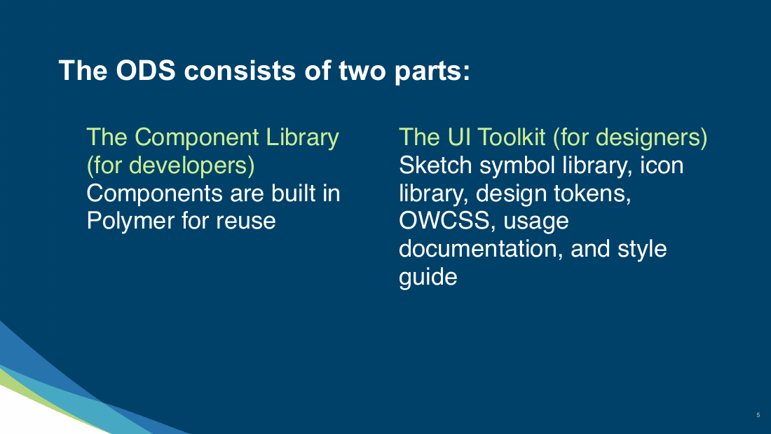
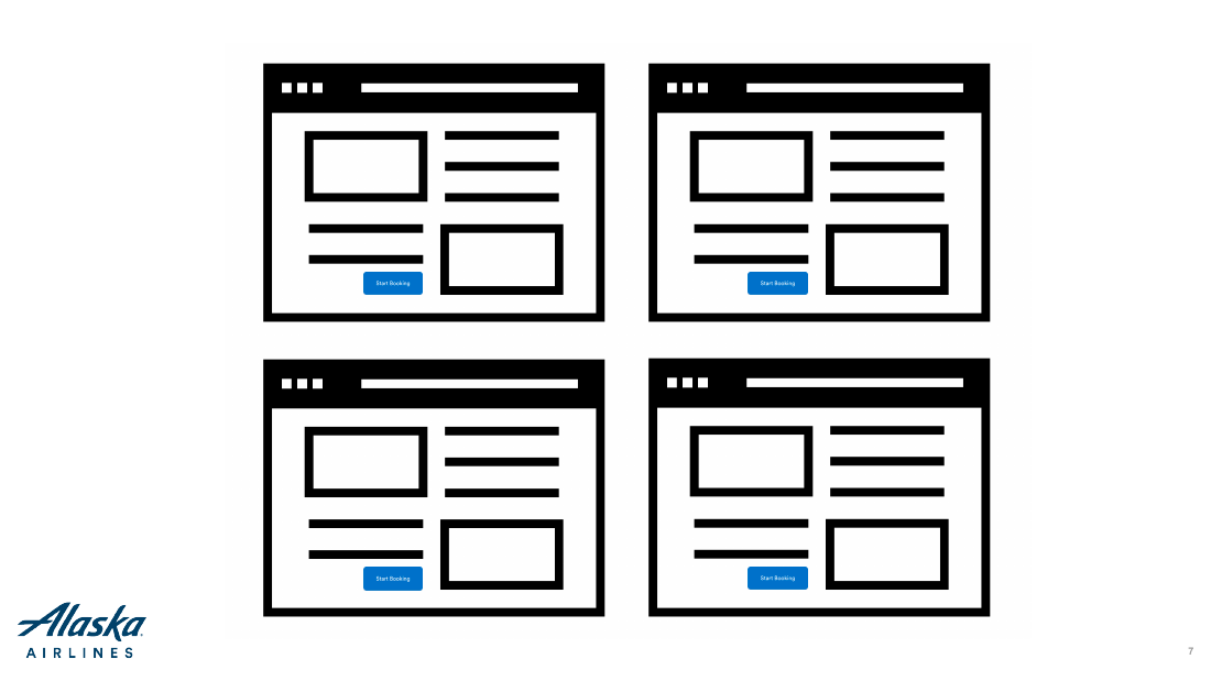
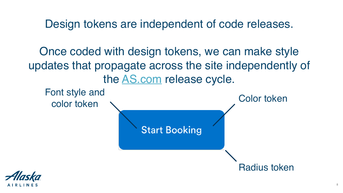
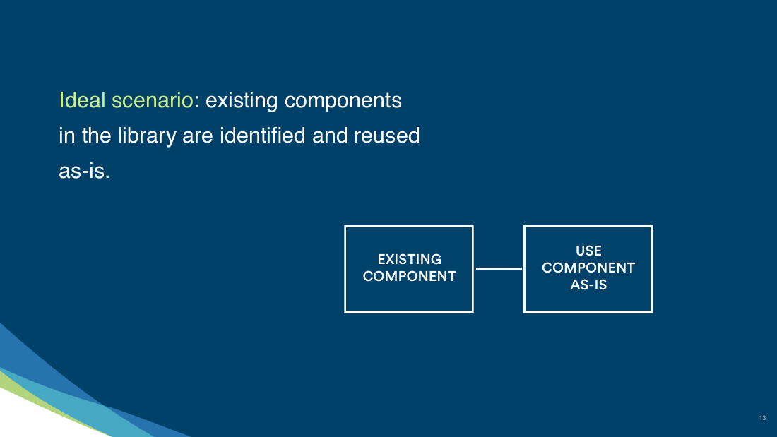
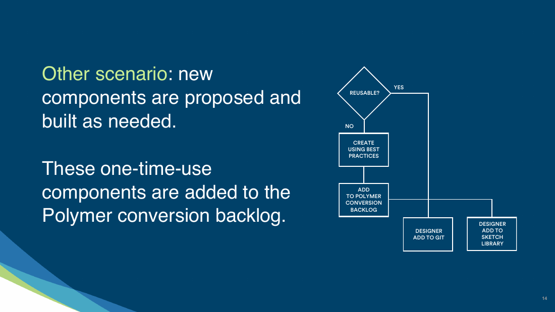
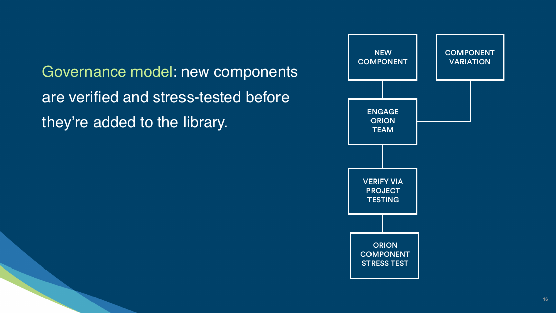
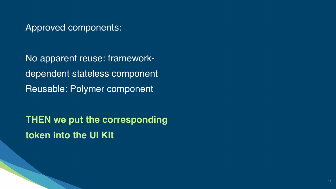
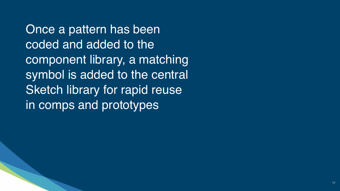
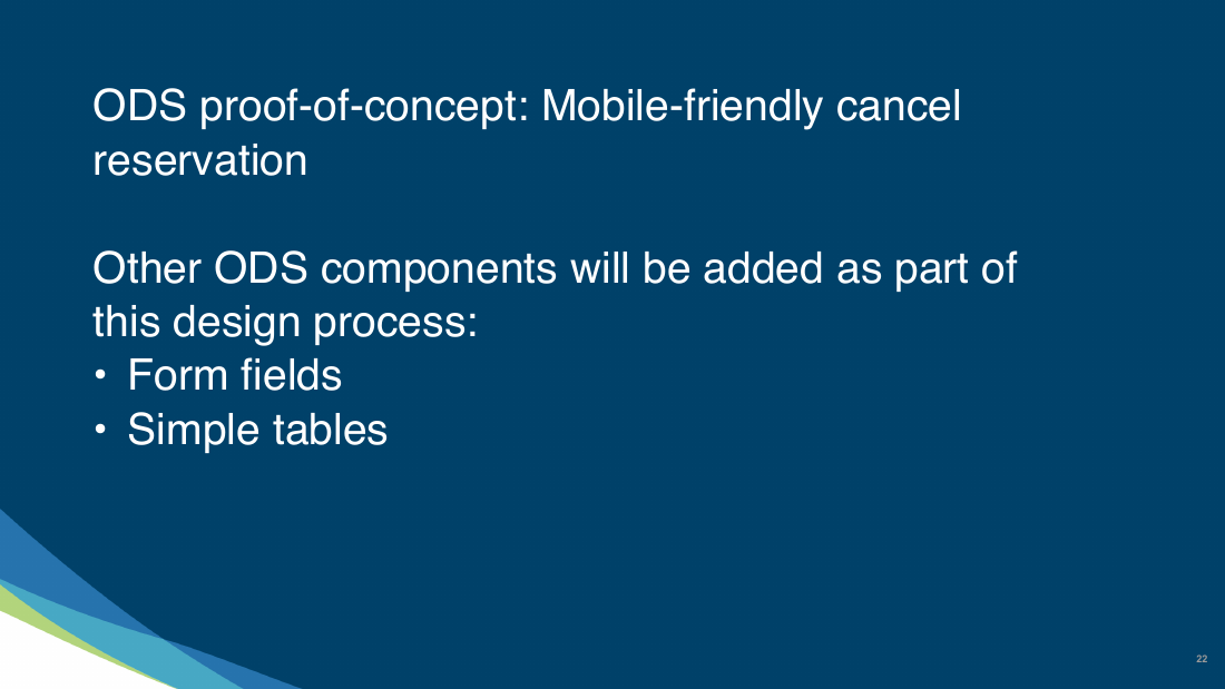
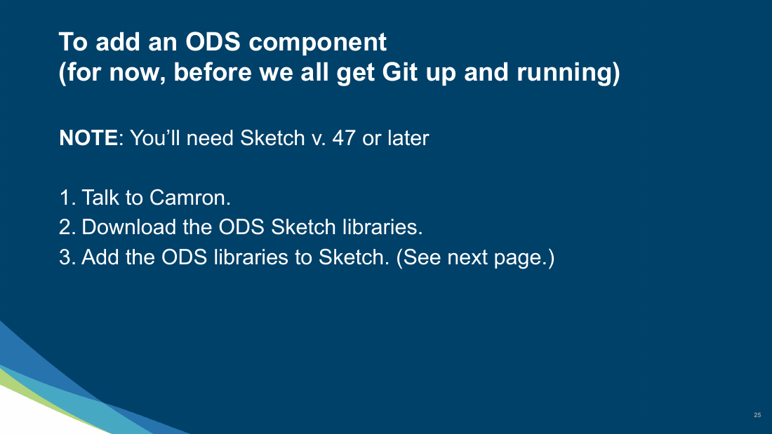
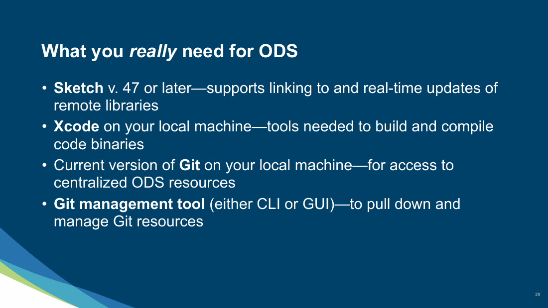
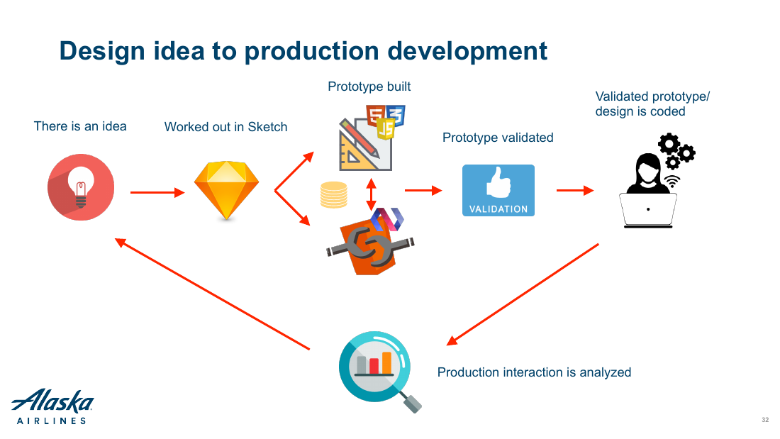
The following is a presentation that Dale and I gave to the entire e-commerce organization at Alaska to introduce them to the concept of design systems and, specifically, the Orion Design System (or ODS).












Building the System Through Product Work
One of the first questions facing any design-system team is where to begin. Marketing provided Alaska’s foundational brand colors, and we established initial rules for typography, color, and spacing, including a two-pixel grid, 14-pixel Circular body text, and #333333 as the primary text color.
Rather than develop components in isolation, we used active product work to give them context. A relatively simple experience, such as a login form, could define multiple foundational elements at once: headings, text fields, buttons, links, validation, and error states.
Orion had no dedicated design-system designers or engineers. To make the work sustainable, we partnered with Product Management and Engineering leadership to embed component creation into product delivery. When a team needed a new component, such as a dropdown menu, that team designed and implemented its first iteration as part of the project.
Dale and I led Orion Design Syncs twice each week to review contributions and coordinate the system’s development. Over nine months, participation grew to include Alaska’s entire IC design team, which contributed designs and definitions for nearly 35 core components. Many of those components were subsequently implemented on alaskaair.com.

Building Adoption Across Design
Dale and I attended a design system conference in New York. Among the topics was the concept of convincing your organization to buy-in to the idea of using design systems as a practice. We heard many stories about how it was challenging to convince engineers to use a design system. Strangely, we had the opposite challenge at Alaska Airlines. The engineering team immediately saw value in the design system and were completely onboard. It was the designers that were reluctant to sign on to using a design system.
To assuage concerns, I hosted a round table discussion with the design team and we discussed the pros and cons of leveraging a design system. Most of their hesitancy revolved around their design work potentially being limited by the perceived constraints of a design system. It helped to explain the difference between “components” and “patterns” in the ODS:
Components are the atomic building blocks for your experience - typography, buttons, text entry fields, etc. – elements that should be consistent across your product.
Patterns are combinations or arrangements of components that are used repeatedly in an experience. Typically, I don’t like to define a Pattern until I know that it will be used 3 or more times in an experience.
Once it became clear that the design system was going to save time and create consistency through the use of components, the designers were less reluctant about using Orion.
Designing for Accessibility
Accessibility was a foundational requirement for Orion and one of the areas I led most directly as an individual contributor. To ground our standards in real customer needs, we held a Q&A and testing session with people with visual impairments. Their feedback helped us understand different forms of visual impairment and evaluate our proposed accessibility guidance. The findings directly informed Orion’s library of accessible interactive components.
The argument I had to win first was about timing. Accessibility at Alaska was treated as a development concern, something addressed in HTML, CSS, and JavaScript after a screen had been designed. Almost everything that actually determines whether a keyboard or screen reader user can finish a booking is decided before that: reading order, what a link says out of context, whether a control is native or invented, which element takes focus next.

The Guidance Itself
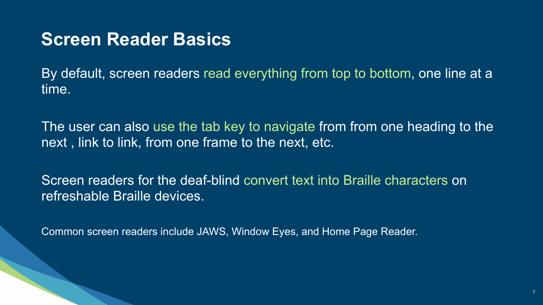
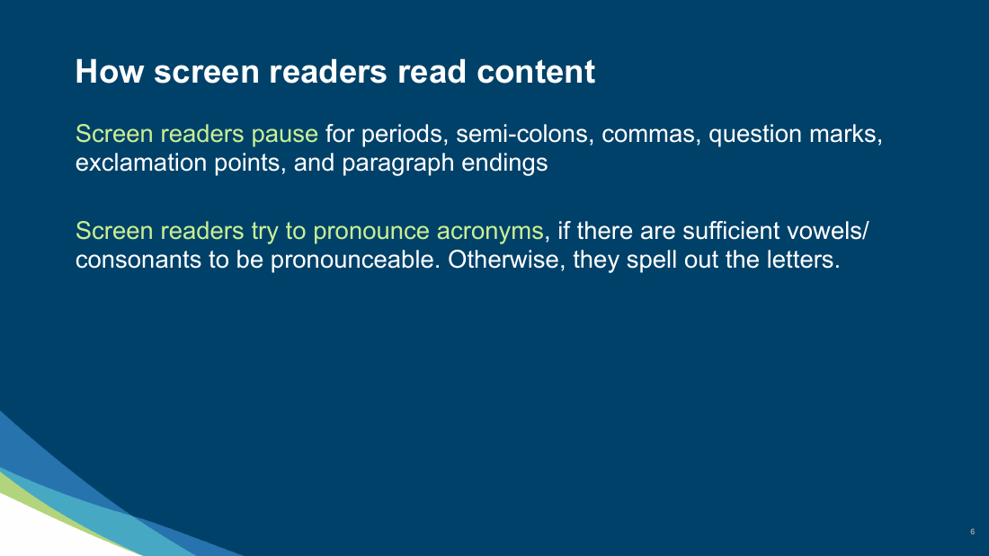
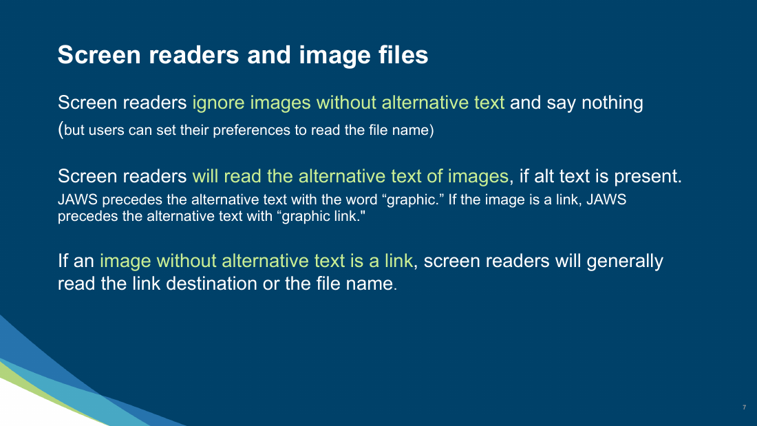
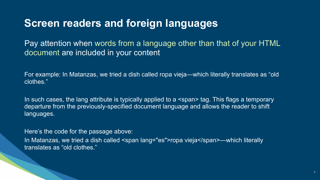
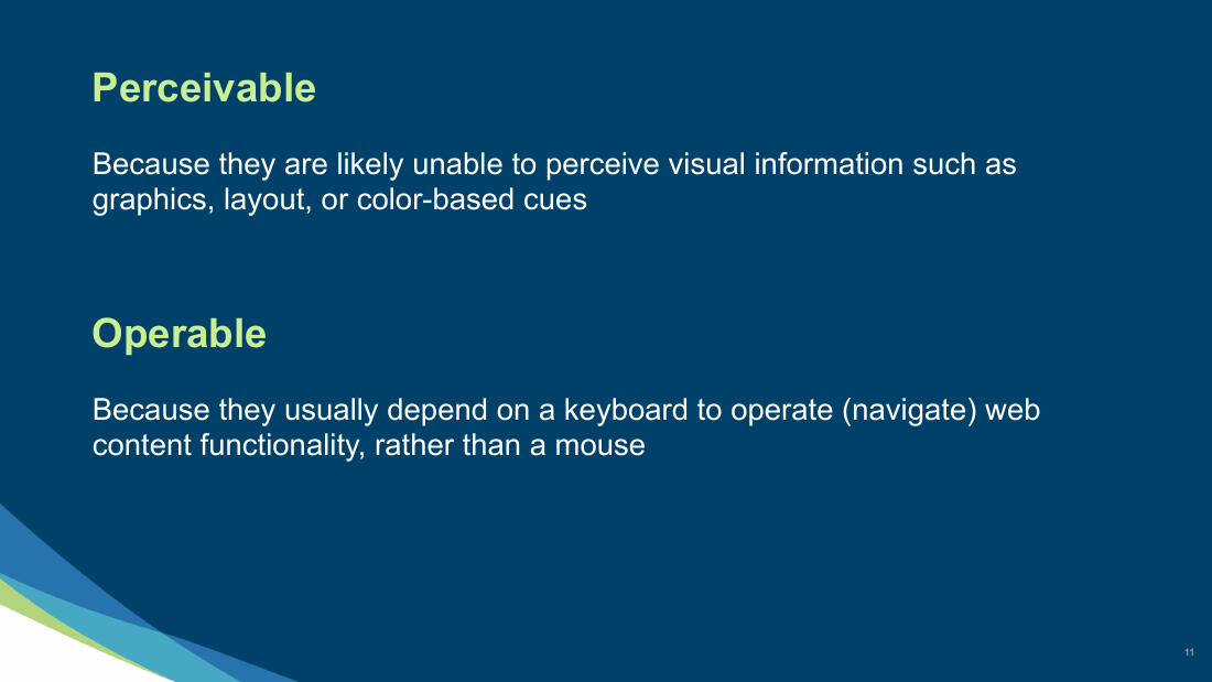
So I wrote the training and gave it to the design org. It starts with how screen readers actually behave: top to bottom, one line at a time, pausing at punctuation, spelling out acronyms they cannot pronounce, saying nothing at all for an image with no alt text. From there it works through the four concepts that matter most for blind customers: perceivable, operable, understandable, robust.
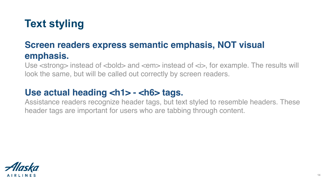
The rest is specific enough to design against. Semantic emphasis rather than visual, because a screen reader announces strong and ignores bold. Real heading tags, so a user can hear an outline of the page and jump to the part they want. Link text that survives being read out of context, since a screen reader user never hears the sentence around it. Native platform controls over custom ones, because they arrive already labelled and focusable. The deck puts the whole problem in one comparison: someone using a screen reader experiences a page like a decision tree in an automated phone system, where not all the options are revealed at once.
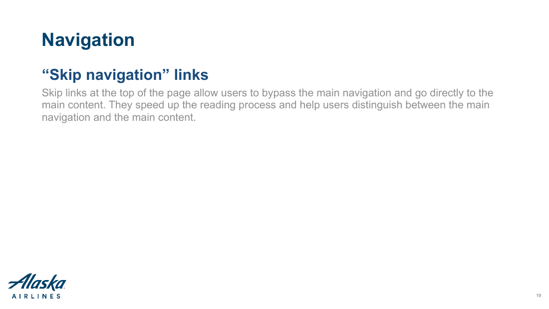
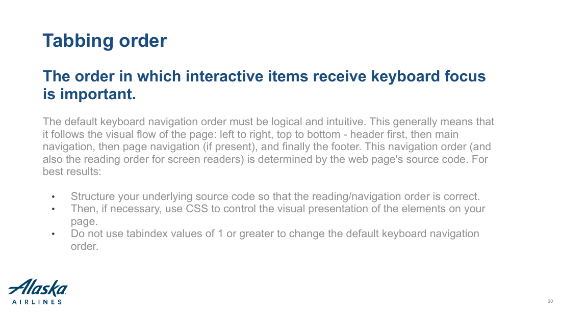
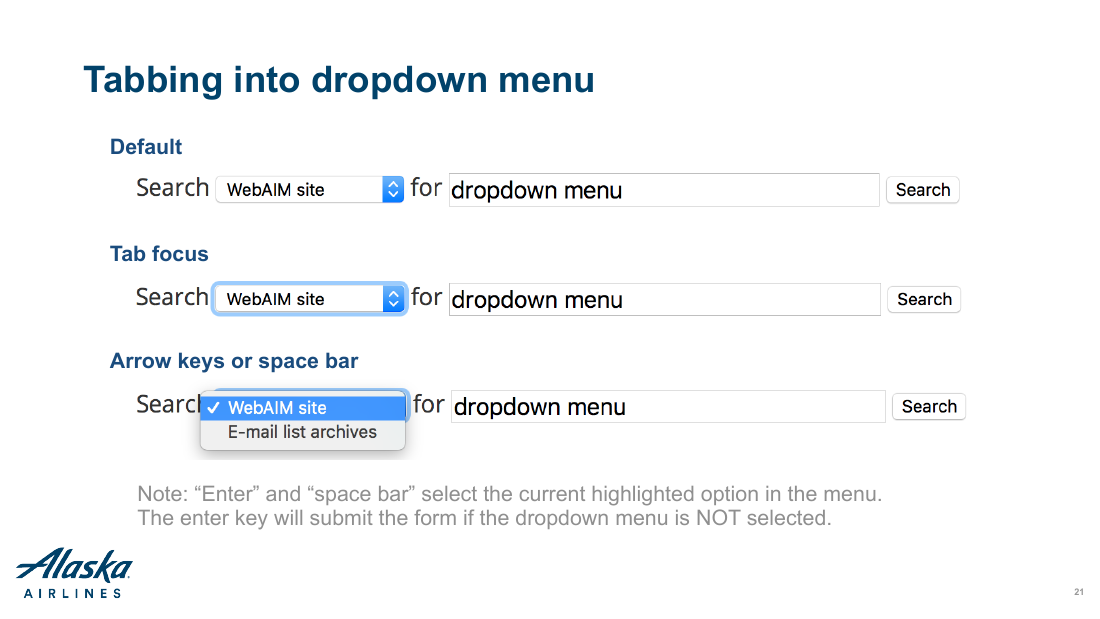
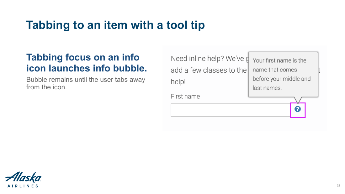
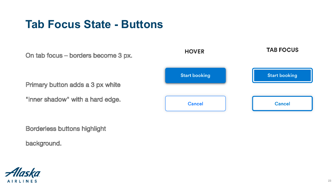
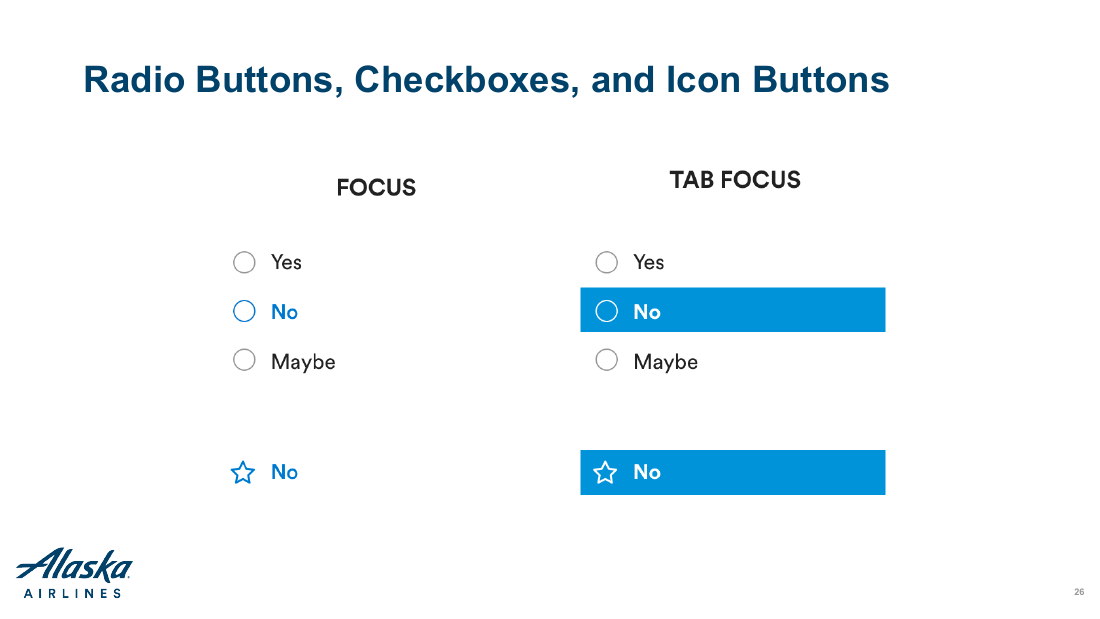
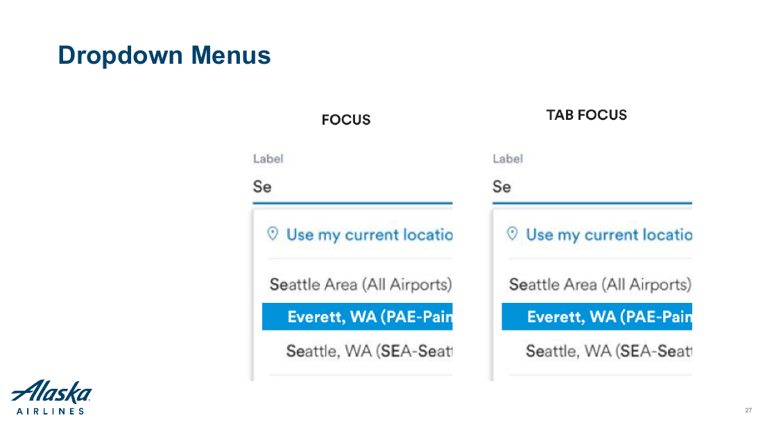
It closes on the part designers own outright. Tab order following the visual flow, skip-navigation links, and the focus states for every interactive element in the system: buttons, hyperlinks, text inputs, radios, checkboxes, icon buttons, tooltips, and dropdown menus.










Extending Alaska’s Brand Palette
Alaska’s Experience Design teams worked closely with Brand Design to maintain alignment between the airline’s digital interfaces and marketing materials. Orion’s creation followed Alaska’s acquisition of Virgin America. As the companies came together, the Brand team wanted to introduce some of Virgin America’s energy through a warmer, more California-influenced visual direction.
Alaska’s established palette was distinctly Pacific Northwest: muted blues, teal, and apple green inspired by the region’s natural environment. While harmonious and recognizable, these colors did not provide enough emphasis for primary calls to action within the interface.
Building on the new California direction, I created a set of warmer secondary colors that complemented the existing palette. The colors were derived from brand photography and refined through systematic HEX-value adjustments, giving Orion stronger accent options without losing its connection to Alaska’s visual identity. This color extension was approved by the Brand team and was subsequently integrated into the marketing brand guidelines.


Reflection
Orion demonstrated that a design system did not require a large dedicated team to create meaningful organizational change. Embedding component development into active product work gave designers and engineers shared ownership of the system. The project reinforced that adoption depends on more than reusable components. It requires a sustainable operating model, clear governance, accessibility grounded in customer feedback, and the trust of the people expected to use it.